In the hyper-competitive landscape of 2026 retail, a storefront is no longer just a point of sale; it is a high-stakes media channel. Yet, walking through any major Indian metro from the luxury hubs of South Mumbai to the high streets of Ban

galore is a recurring theme: premium brands struggling with “Visual Friction.”
When a store feels “unprofessional,” it is rarely because of the product. It is because the physical branding the “handshake” of the business is failing to communicate quality. In professional branding, the difference between “local shop” and “global brand” is found in the engineering.Here is a breakdown of the visual failures currently plaguing retail environments and the structural shifts required to rectify them.
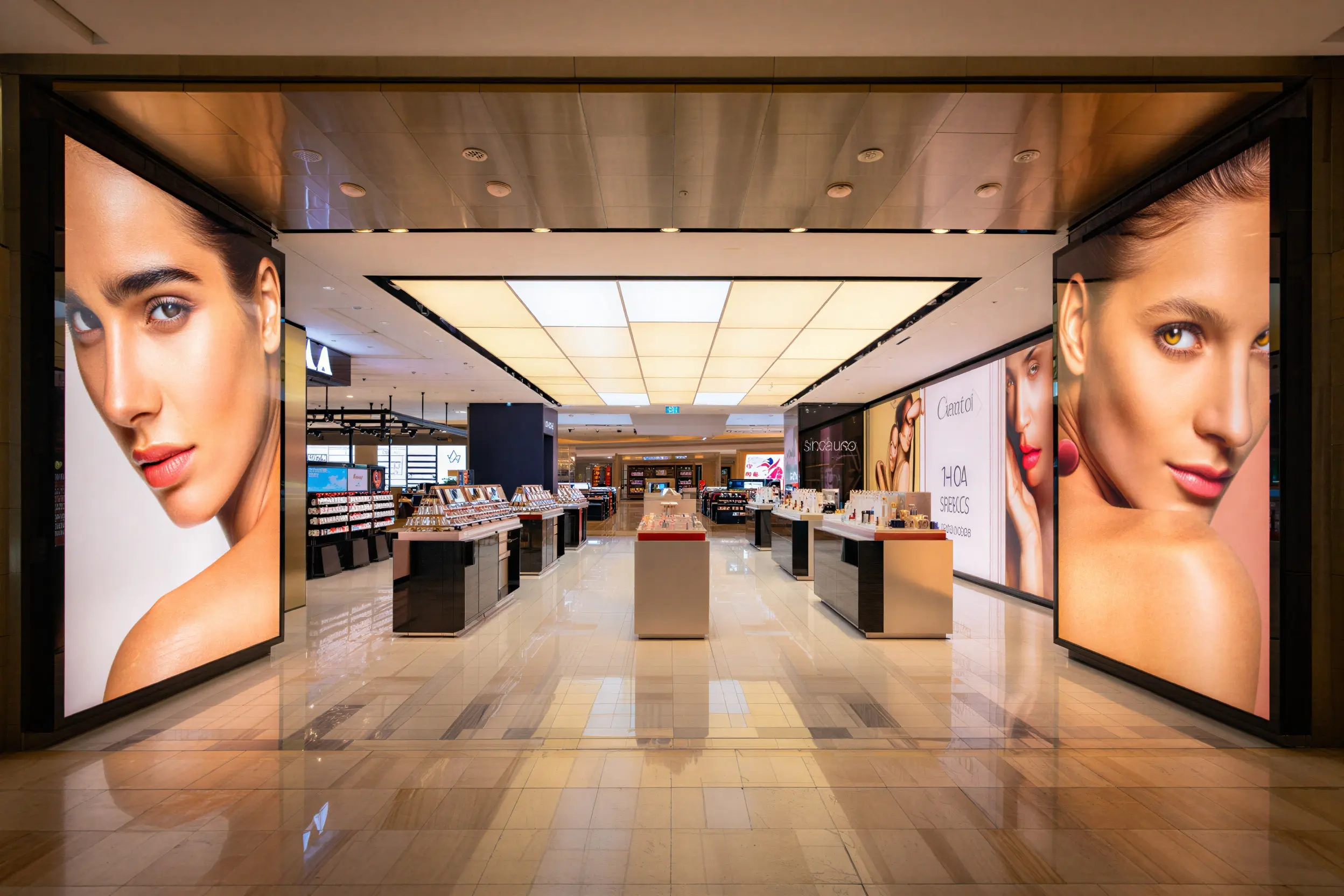
The Lighting Paradox: Brightness vs. Uniformity
The most common mistake in Indian retail is confusing brightness with quality. A sign that is “bright” but suffers from “hotspots” visible LED dots or patchy shadows unintentionally signals a low-budget approach.
Professionalism is found in diffused luminance. High-end environments utilize systems where the light source is invisible, creating a soft, expensive-looking glow that doesn’t strain the eye.
Transitioning to Backlit Fabric Lightboxes. Unlike traditional vinyl, UV-printed fabric paired with high-density LED strips provides a matte, glare-free finish. The result is a seamless, high-definition visual that looks consistent from every viewing angle.
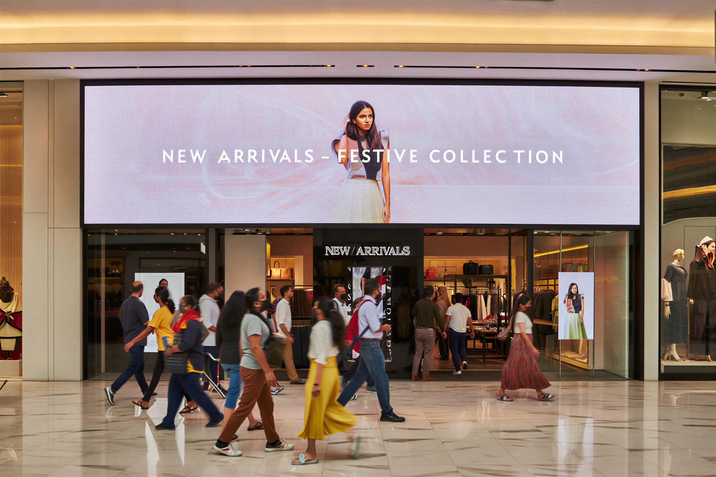
The “Pixel Pitch” Gap in Digital Displays
As businesses move toward LED Display Signage, many fall into the trap of using outdoor-grade specifications for indoor environments. Seeing “grainy” text or jagged images on a screen while standing 5 feet away breaks the premium illusion instantly.
Understanding viewing distance. For indoor showrooms, a P2.5 or P3 resolution is the industry standard. It ensures that motion graphics remain crisp and high-definition, mimicking the quality of a smartphone screen rather than a roadside billboard.
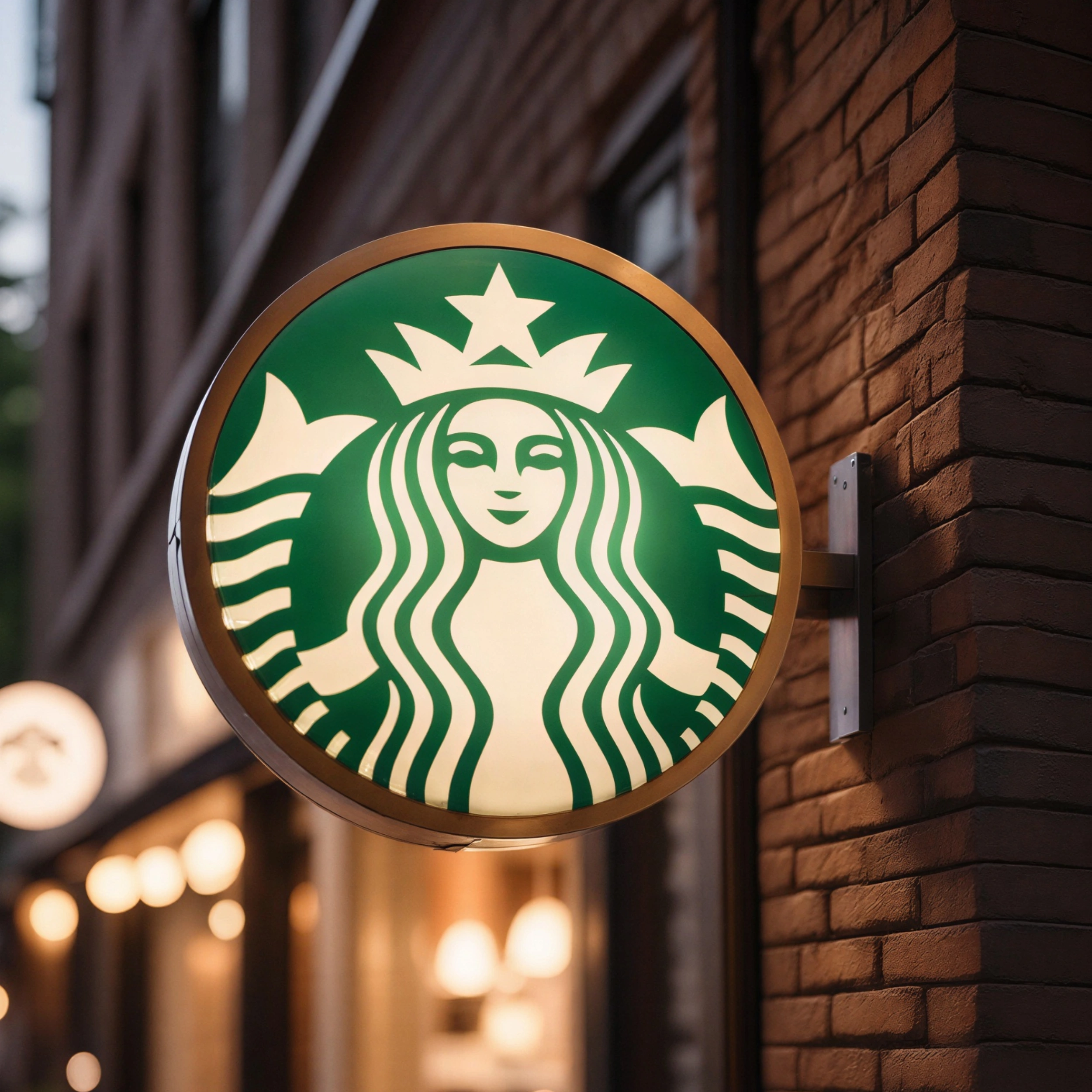
The Fallacy of Dimensionality
Flat signage looks temporary. In the psychology of commercial architecture, depth equals permanence. A flat vinyl board suggests a “pop-up” mentality, whereas dimensional elements suggest a brand that is established and trustworthy.
Implementing Acrylic Letter Displays. By utilizing precision-cut 3D letters with integrated LED backlighting (the “halo effect”), you create a sense of structural authority. The play of light and shadow on a 3D surface adds a layer of sophistication that 2D prints simply cannot replicate.
Operational Clutter: The Death of Minimalist Design
A store’s professional aesthetic often dies a “death by a thousand posters.” Seasonal offers, QR codes, and temporary announcements taped to the glass create visual noise that degrades the brand’s perceived value.
Systematizing the mess. Use Slim & Clip-On Frames for campaign updates and Lollipop Display Stands for entry-level promotions. This ensures that even “temporary” messages feel like they are part of the store’s intentional architecture.
Professionalism in retail is the absence of visual mistakes. It is the result of color accuracy, material selection, and lighting engineering working in harmony. At Star Digital, we don’t just “print boards”; we build the systems that help brands claim their space.
Is your store currently a “trust leak”? Explore our Premium Signage Systems or Request a Visibility Audit today.